Nameplates: Difference between revisions
m Added User_Interface category |
Removed upcoming notice for 2025.4.2 |
||
| (16 intermediate revisions by 5 users not shown) | |||
| Line 1: | Line 1: | ||
{{Noticebox/Official}} | {{Noticebox/Official}} | ||
Nameplates are a UI element that displays above users' [[avatars]] that contains their display name, group information, status, trust rank, fallback status, and other details. | Nameplates are a UI element that displays above users' [[Special:MyLanguage/avatars|avatars]] that contains their display name, group information, status, trust rank, fallback status, and other details. | ||
<gallery mode="packed" heights="120"> | <gallery mode="packed" heights="120"> | ||
| Line 12: | Line 11: | ||
Nameplates are complex and contain a variety of elements, but are customizable, allowing you to turn off elements you may not want to see. | Nameplates are complex and contain a variety of elements, but are customizable, allowing you to turn off elements you may not want to see. | ||
Additional information gets shown when the [[Quick Menu]] is open, such as group, trust rank, and fallback information. You can turn this off by disabling the "Show Additional Info on Nameplates" setting. | Additional information gets shown when the [[Special:MyLanguage/Quick Menu|Quick Menu]] is open, such as group, trust rank, and fallback information. You can turn this off by disabling the "Show Additional Info on Nameplates" setting. | ||
===Display name=== | === Main Bar === | ||
==== Display name ==== | |||
The display name is the nameplates main element, which the rest of the elements center around. This element simply displays the user's display name. | The display name is the nameplates main element, which the rest of the elements center around. This element simply displays the user's display name. | ||
This is permanently visible unless you change the "Nameplate Visibility" setting. | This is permanently visible unless you change the "Nameplate Visibility" setting. | ||
===Status=== | <gallery mode="packed" heights="120"> | ||
The [[Social#Statuses|status]] element appears directly under the display name. This element displays the user's status icon and custom status message. | File:VRChatNameplate.png|Default nameplate with display name | ||
</gallery> | |||
==== Status ==== | |||
The [[Special:MyLanguage/Social#Statuses|status]] element appears directly under the display name. This element displays the user's status icon and custom status message. | |||
This is visible when opening up the Quick Menu or permanently shown when enabling the "Status Shown" option in the [[Action Menu]]. | This is visible when opening up the Quick Menu or permanently shown when enabling the "Status Shown" option in the [[Special:MyLanguage/Action Menu|Action Menu]]. | ||
===Icon=== | ==== Icon ==== | ||
The [[ | The [[Special:MyLanguage/Gallery#Icons|icon]] element appears to the left of the display name. This element displays the [[Special:MyLanguage/VRC+|VRC+]] icon image and only appears when the user is chooses to display their VRC+ icon image. | ||
This is permanently visible unless you change the "Nameplate Visibility" setting. | This is permanently visible unless you change the "Nameplate Visibility" setting. | ||
===Trust Rank=== | ==== Mutuals ==== | ||
The [[Trust Rank|trust rank]] element appears above the display name to the left. This element displays the user's trust rank and changes the color of the text to match the trust rank color. | The [[mutuals]] element appears on either the top left of the icon if the user has one, or the top left of the display name. This element displays the shared connection icon, indicating the user has shared mutuals. This element only appears if the user has shared mutuals & aren't friends. | ||
<gallery mode="packed" heights="120"> | |||
File:Nameplate MutualsIcon.png|Mutuals icon element | |||
</gallery> | |||
==== Group ==== | |||
The [[Special:MyLanguage/Groups|group]] element appears above the display name and below the trust rank and performance rank & fallback status elements. This element displays the name of the group, their group short code and the group banner. | |||
The group name, and code is only visible when opening up the Quick Menu. While, the group banner is permanently visible unless you disable the "Show Group Banner" setting. Disabling "Show Group Banner" will also remove the group name, and group short code. | |||
<gallery mode="packed" heights="120"> | |||
File:Nameplate_GroupBanner.png|Default nameplate showcasing group banner | |||
File:Nameplate_GroupBannerMoreInfo.png|Default nameplate with additional info showcasing group banner | |||
</gallery> | |||
==== Earmuffs ==== | |||
''See also [[Special:MyLanguage/Earmuff Mode|Earmuff Mode]] for more detailed information.'' | |||
The earmuffs element appears on the top right of the display name. This element displays an earmuffs icon, which tells you if the user is using the earmuffs feature. | |||
This is permanently visible unless you change the "Nameplate Visibility" setting. | |||
=== Top Bar === | |||
==== Mutuals ==== | |||
The mutuals element appears above the display name to the left. This element displays the user's mutuals (friend or group) and total of number of mutuals shared between each other. This element only appears if the user has shared mutuals & aren't friends. | |||
Mutuals element is only visible when opening up the Quick Menu. | |||
<gallery mode="packed" heights="50"> | |||
File:Nameplate Mutuals.png|Mutuals element with Trust Rank & Performance Rank elements. | |||
</gallery> | |||
==== Trust Rank ==== | |||
The [[Special:MyLanguage/Trust Rank|trust rank]] element appears above the display name to the left. This element displays the user's trust rank and changes the color of the text to match the trust rank color. | |||
This is only visible when opening up the Quick Menu. | This is only visible when opening up the Quick Menu. | ||
===Performance Rank & fallback status=== | ===== Age Verification ===== | ||
The [https://creators.vrchat.com/avatars/avatar-performance-ranking-system/ performance rank] & fallback status element appears above the display name to the right. This element displays either the performance rank, if the user's avatar is shown, or the fallback status, if the user's avatar is affected by the [[Fallbacks#Avatar Fallback System|Avatar Fallback System]]. | An alternate icon appears when a user is [[Special:MyLanguage/Age Verification|age verified]]. This adds a checkmark icon in the bottom right of the trust rank badge. This does not guarantee a user is over the age of eighteen. Check the user's profile to see if they have an additional "Verified 18+" marker. | ||
==== Performance Rank & fallback status ==== | |||
The [https://creators.vrchat.com/avatars/avatar-performance-ranking-system/ performance rank] & fallback status element appears above the display name to the right. This element displays either the performance rank, if the user's avatar is shown, or the fallback status, if the user's avatar is affected by the [[Special:MyLanguage/Fallbacks#Avatar Fallback System|Avatar Fallback System]]. | |||
The performance rank text color changes to match the performance rank colors. | The performance rank text color changes to match the performance rank colors. | ||
| Line 41: | Line 83: | ||
This is only visible when opening up the Quick Menu. | This is only visible when opening up the Quick Menu. | ||
====Fallback icon==== | ===== Fallback icon ===== | ||
The fallback icon element appears above the display name to the right. This element displays only the fallback icon when viewing a user's avatar affected by the Avatar Fallback System. | The fallback icon element appears above the display name to the right. This element displays only the fallback icon when viewing a user's avatar affected by the Avatar Fallback System. | ||
This is permanently visible unless you change the "Nameplate Visibility" setting. | This is permanently visible unless you change the "Nameplate Visibility" setting. | ||
=== | <gallery mode="packed" heights="50"> | ||
The | File:Nameplate_TrustAndPerformance.png|Element with "Visitor" trust rank & "Excellent" performance rank | ||
File:Nameplate_TrustAndFallback.png|Element with "Vistior" trust rank & "Missing Asset" fallback icon | |||
</gallery> | |||
=== Bottom Bar === | |||
==== Pronouns ==== | |||
The pronouns element appears below the status element. This element displays the user's [[Special:MyLanguage/Social#Pronouns|pronouns]]. | |||
This is permanently visible unless you change the "Nameplate Visibility" setting. | |||
<gallery mode="packed" heights="120"> | |||
File:NameplatePronouns.png|Nameplate with "they/them" as their pronouns. | |||
</gallery> | |||
===Platform=== | ==== Platform ==== | ||
The [[Platforms|platform]] element appears below and to the right of the status element. This element displays the name and icon of the platform they are currently using VRChat on. | The [[Special:MyLanguage/Platforms|platform]] element appears below and to the right of the status element. This element displays the name and icon of the platform they are currently using VRChat on. | ||
This is only visible when opening up the Quick Menu. | This is only visible when opening up the Quick Menu. | ||
===Avatar interaction=== | <gallery mode="packed" heights="70"> | ||
The avatar interaction element appears below the status element. This element displays a hand icon | File:Nameplate_AndroidPlatform.png|Android nameplate element | ||
File:Nameplate_iOSPlatform.png|iOS nameplate element | |||
</gallery> | |||
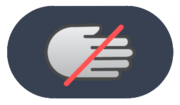
==== Avatar interaction ==== | |||
The avatar interaction element appears below the status element. This element displays a grayed out hand icon if you aren't allowed to interact with the user's avatar. The icon will not appear if the user has their interaction on or if they are friends with each other. Detailed information about this element can be found on the [https://docs.vrchat.com/docs/permissions-and-settings Avatar Interaction Permissions and Settings] page of the VRChat Documentation Hub. | |||
This is only visible when opening up the Quick Menu. | This is only visible when opening up the Quick Menu. | ||
=== | <gallery mode="packed" heights="70"> | ||
The | File:Nameplate_AvatarInteractionOff.png|Avatar interaction off | ||
</gallery> | |||
==== Audio ==== | |||
===== Microphone level ===== | |||
The microphone level element appears below and to the right of the status element. This element displays a "volume" icon with the microphone level percentage of the user you're viewing. | |||
This element is only visible under these conditions: | |||
*The user's microphone level is not at default 100%. | |||
*The user is not muted or deafened. | |||
This is only visible when opening up the Quick Menu. | |||
<gallery mode="packed" heights="70"> | |||
File:NameplateMicrophoneLevel.png|Microphone level element with the user microphone level set to 120% | |||
</gallery> | |||
===Muted & Deafen=== | ===== Muted & Deafen ===== | ||
The muted element appears below and to the right of the status element. This element displays either a "volume crossed" icon when the user you're viewing is muted by yourself, or a "deafen crossed" icon when the user you're viewing muted you. Both icons can appear if both conditions above are true. | The muted element appears below and to the right of the status element. This element displays either a "volume crossed" icon when the user you're viewing is muted by yourself, or a "deafen crossed" icon when the user you're viewing muted you. Both icons can appear if both conditions above are true. | ||
| Line 112: | Line 182: | ||
*Status (If setting is set to "shown") | *Status (If setting is set to "shown") | ||
*Muted & Deafen | *Muted & Deafen | ||
*Pronouns | |||
When the "Icon" nameplate visibility is selected, only the Icon element will be visible. And the "Hidden" nameplate visibility is selected, no elements will be visible. | When the "Icon" nameplate visibility is selected, only the Icon element will be visible. And the "Hidden" nameplate visibility is selected, no elements will be visible. | ||
| Line 118: | Line 189: | ||
*Trust Rank | *Trust Rank | ||
*Performance Rank & Fallback Status Note: Fallback Icon will still be shown | *Performance Rank & Fallback Status | ||
**'''Note:''' Fallback Icon will still be shown | |||
*Group name and code | *Group name and code | ||
*Platform | *Platform | ||
| Line 130: | Line 202: | ||
*Muted & Deafen | *Muted & Deafen | ||
[[Category:Needs | ==References== | ||
[[Category:User_Interface]] | <references/> | ||
[[Category:Needs images{{#translation:}}]] | |||
[[Category:User_Interface{{#translation:}}]] | |||
Latest revision as of 04:57, 4 December 2025

Nameplates are a UI element that displays above users' avatars that contains their display name, group information, status, trust rank, fallback status, and other details.
-
 Default nameplate
 -
 Default nameplate with additional info


Elements
Nameplates are complex and contain a variety of elements, but are customizable, allowing you to turn off elements you may not want to see.
Additional information gets shown when the Quick Menu is open, such as group, trust rank, and fallback information. You can turn this off by disabling the "Show Additional Info on Nameplates" setting.
Main Bar
Display name
The display name is the nameplates main element, which the rest of the elements center around. This element simply displays the user's display name.
This is permanently visible unless you change the "Nameplate Visibility" setting.
-
Default nameplate with display name
Status
The status element appears directly under the display name. This element displays the user's status icon and custom status message.
This is visible when opening up the Quick Menu or permanently shown when enabling the "Status Shown" option in the Action Menu.
Icon
The icon element appears to the left of the display name. This element displays the VRC+ icon image and only appears when the user is chooses to display their VRC+ icon image.
This is permanently visible unless you change the "Nameplate Visibility" setting.
Mutuals
The mutuals element appears on either the top left of the icon if the user has one, or the top left of the display name. This element displays the shared connection icon, indicating the user has shared mutuals. This element only appears if the user has shared mutuals & aren't friends.
-
 Mutuals icon element

Group
The group element appears above the display name and below the trust rank and performance rank & fallback status elements. This element displays the name of the group, their group short code and the group banner.
The group name, and code is only visible when opening up the Quick Menu. While, the group banner is permanently visible unless you disable the "Show Group Banner" setting. Disabling "Show Group Banner" will also remove the group name, and group short code.
-
 Default nameplate showcasing group banner
 -
 Default nameplate with additional info showcasing group banner


Earmuffs
See also Earmuff Mode for more detailed information.
The earmuffs element appears on the top right of the display name. This element displays an earmuffs icon, which tells you if the user is using the earmuffs feature.
This is permanently visible unless you change the "Nameplate Visibility" setting.
Top Bar
Mutuals
The mutuals element appears above the display name to the left. This element displays the user's mutuals (friend or group) and total of number of mutuals shared between each other. This element only appears if the user has shared mutuals & aren't friends.
Mutuals element is only visible when opening up the Quick Menu.
-
 Mutuals element with Trust Rank & Performance Rank elements.
Trust Rank
The trust rank element appears above the display name to the left. This element displays the user's trust rank and changes the color of the text to match the trust rank color.
This is only visible when opening up the Quick Menu.
Age Verification
An alternate icon appears when a user is age verified. This adds a checkmark icon in the bottom right of the trust rank badge. This does not guarantee a user is over the age of eighteen. Check the user's profile to see if they have an additional "Verified 18+" marker.
Performance Rank & fallback status
The performance rank & fallback status element appears above the display name to the right. This element displays either the performance rank, if the user's avatar is shown, or the fallback status, if the user's avatar is affected by the Avatar Fallback System.
The performance rank text color changes to match the performance rank colors.
This is only visible when opening up the Quick Menu.
Fallback icon
The fallback icon element appears above the display name to the right. This element displays only the fallback icon when viewing a user's avatar affected by the Avatar Fallback System.
This is permanently visible unless you change the "Nameplate Visibility" setting.
-
 Element with "Visitor" trust rank & "Excellent" performance rank
 -
 Element with "Vistior" trust rank & "Missing Asset" fallback icon


Bottom Bar
Pronouns
The pronouns element appears below the status element. This element displays the user's pronouns.
This is permanently visible unless you change the "Nameplate Visibility" setting.
-
 Nameplate with "they/them" as their pronouns.

Platform
The platform element appears below and to the right of the status element. This element displays the name and icon of the platform they are currently using VRChat on.
This is only visible when opening up the Quick Menu.
-
 Android nameplate element
 -
 iOS nameplate element


Avatar interaction
The avatar interaction element appears below the status element. This element displays a grayed out hand icon if you aren't allowed to interact with the user's avatar. The icon will not appear if the user has their interaction on or if they are friends with each other. Detailed information about this element can be found on the Avatar Interaction Permissions and Settings page of the VRChat Documentation Hub.
This is only visible when opening up the Quick Menu.
-
 Avatar interaction off
Audio
Microphone level
The microphone level element appears below and to the right of the status element. This element displays a "volume" icon with the microphone level percentage of the user you're viewing.
This element is only visible under these conditions:
- The user's microphone level is not at default 100%.
- The user is not muted or deafened.
This is only visible when opening up the Quick Menu.
-
 Microphone level element with the user microphone level set to 120%

Muted & Deafen
The muted element appears below and to the right of the status element. This element displays either a "volume crossed" icon when the user you're viewing is muted by yourself, or a "deafen crossed" icon when the user you're viewing muted you. Both icons can appear if both conditions above are true.
This is permanently visible unless you change the "Nameplate Visibility" setting.
-
 Muted icon
 -
 Deafen icon


Viewing and visuals
Nameplate elements can dynamically update to indicate various states and circumstances.
Speaking
When the user is speaking, the border around the display name and icon will pulse blue.
-
 Nameplate when user is speaking

Display name and icon
The display name element is only viewable within 30 meters of the user. Beyond that distance the user's icon will show instead.
Status element
The status element is only viewable within 6-7 meters of the user. Beyond that distance the status will be hidden.
Rendering
Nameplates appear in the order of closest to furthest user away from you. The opposite effect happens when nameplates start disappearing.
Friends
If you are friends with the user, multiple changes happen:
- Display name text will turn yellow.
- Trust rank will instead display "Friend" with their trust rank in brackets, and turn the text yellow.
- If you are more than 30 meters away from the user, a yellow pin drop with a person icon with appear above their head.
- If the "Nameplate Visibility" setting is set to "Icon", a yellow person icon with appear in the top left of the icon element.
Nameplate element visibility
Different scenarios will cause the nameplate to appear differently.
When the "Standard" nameplate visibility is selected, the following elements will be visible:
- Display name
- Icon
- Status (If setting is set to "shown")
- Muted & Deafen
- Pronouns
When the "Icon" nameplate visibility is selected, only the Icon element will be visible. And the "Hidden" nameplate visibility is selected, no elements will be visible.
When "Show Additional Info" is turned off, the following elements will not be visible.
- Trust Rank
- Performance Rank & Fallback Status
- Note: Fallback Icon will still be shown
- Group name and code
- Platform
- Avatar Interaction
These settings will affect visibility of these elements whether "Show Additional Info" is enabled or disabled.
- Show Group Banner
- Show Fallback Icon
- Show Earmuffs Icon
- Muted & Deafen