Nameplates


Nameplates are a UI element that displays above users' avatars that contains their display name, group information, status, trust rank, fallback status, and other details.
-
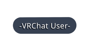 Default nameplate
 -
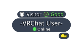 Default nameplate with additional info


Elements
Nameplates are complex and contain a variety of elements, but are customizable, allowing you to turn off elements you may not want to see.
Additional information gets shown when the Quick Menu is open, such as group, trust rank, and fallback information. You can turn this off by disabling the "Show Additional Info on Nameplates" setting.
Main Bar
Display name
The display name is the nameplates main element, which the rest of the elements center around. This element simply displays the user's display name.
This is permanently visible unless you change the "Nameplate Visibility" setting.
-
Default nameplate with display name
Status
The status element appears directly under the display name. This element displays the user's status icon and custom status message.
This is visible when opening up the Quick Menu or permanently shown when enabling the "Status Shown" option in the Action Menu.
User icon
The user icon element appears to the left of the display name.
This is permanently visible unless you change the "Nameplate Visibility" setting.
Mutuals
The mutuals element appears on either the top left of the user icon if the user has one, or the top left of the display name. This element displays the shared connection icon, indicating the user has shared mutuals. This element only appears if the user has shared mutuals & aren't friends.
-
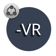 Mutuals icon element

Group
The group element appears above the display name and below the trust rank and performance rank & fallback status elements. This element displays the name of the group, their group short code and the group banner.
The group name, and code is only visible when opening up the Quick Menu. While, the group banner is permanently visible unless you disable the "Show Group Banner" setting. Disabling "Show Group Banner" will also remove the group name, and group short code.
-
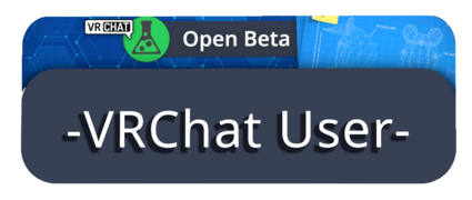 Default nameplate showcasing group banner
 -
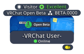 Default nameplate with additional info showcasing group banner


Earmuffs
See also Earmuff Mode for more detailed information.
The earmuffs element appears on the top right of the display name. This element displays an earmuffs icon, which tells you if the user is using the earmuffs feature.
This is permanently visible unless you change the "Nameplate Visibility" setting.
Top Bar
Mutuals
The mutuals element appears above the display name to the left. This element displays the user's mutuals (friend or group) and total of number of mutuals shared between each other. This element only appears if the user has shared mutuals & aren't friends.
Mutuals element is only visible when opening up the Quick Menu.
-
 Mutuals element with Trust Rank & Performance Rank elements.

Trust Rank
The trust rank element appears above the display name to the left. This element displays the user's trust rank and changes the color of the text to match the trust rank color.
This is only visible when opening up the Quick Menu.
Age Verification
An alternate icon appears when a user is age verified. This adds a checkmark icon in the bottom right of the trust rank badge. This does not guarantee a user is over the age of eighteen. Check the user's profile to see if they have an additional "Verified 18+" marker.
Performance Rank & fallback status
The performance rank & fallback status element appears above the display name to the right. This element displays either the performance rank, if the user's avatar is shown, or the fallback status, if the user's avatar is affected by the Avatar Fallback System.
The performance rank text color changes to match the performance rank colors.
This is only visible when opening up the Quick Menu.
Fallback icon
The fallback icon element appears above the display name to the right. This element displays only the fallback icon when viewing a user's avatar affected by the Avatar Fallback System.
This is permanently visible unless you change the "Nameplate Visibility" setting.
-
 Element with "Visitor" trust rank & "Excellent" performance rank
 -
 Element with "Vistior" trust rank & "Missing Asset" fallback icon


Bottom Bar
Pronouns
The pronouns element appears below the status element. This element displays the user's pronouns.
This is permanently visible unless you change the "Nameplate Visibility" setting.
-
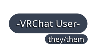 Nameplate with "they/them" as their pronouns.

Platform
The platform element appears below and to the right of the status element. If the user is not on PC, this element displays with the name and icon of the platform they are currently running VRChat on.
This is only visible when opening up the Quick Menu.
-
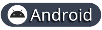 Android nameplate element
 -
 iOS nameplate element


Avatar interaction
The avatar interaction element appears below the status element. This element displays a grayed out hand icon if you aren't allowed to interact with the user's avatar. The icon will not appear if the user has their interaction on or if they are friends with each other. Detailed information about this element can be found on the Avatar Interaction Permissions and Settings page of the VRChat Documentation Hub.
This is only visible when opening up the Quick Menu.
-
 Avatar interaction off

Audio
Microphone level
The microphone level element appears below and to the right of the status element. This element displays a "volume" icon with the microphone level percentage of the user you're viewing.
This element is only visible under these conditions:
- The user's microphone level is not at default 100%.
- The user is not muted or deafened.
This is only visible when opening up the Quick Menu.
-
 Microphone level element with the user microphone level set to 120%

Muted & Deafen
The muted element appears below and to the right of the status element. This element displays either a "volume crossed" icon when the user you're viewing is muted by yourself, or a "deafen crossed" icon when the user you're viewing muted you. Both icons can appear if both conditions above are true.
This is permanently visible unless you change the "Nameplate Visibility" setting.
-
 Muted icon
 -
 Deafen icon


Viewing and visuals
Nameplate elements can dynamically update to indicate various states and circumstances.
Speaking
When the user is speaking, the border around the display name and user icon will pulse blue.
-
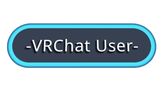 Nameplate when user is speaking

Display name and user icon
The display name element is only viewable within 30 meters of the user. Beyond that distance the user icon will show instead.
Status element
The status element is only viewable within 6-7 meters of the user. Beyond that distance the status will be hidden.
Rendering
Nameplates appear in the order of closest to furthest user away from you. The opposite effect happens when nameplates start disappearing.
Friends
If you are friends with the user, multiple changes happen:
- Display name text will turn yellow.
- Trust rank will instead display "Friend" with their trust rank in brackets, and turn the text yellow.
- If you are more than 30 meters away from the user, a yellow pin drop with a person icon with appear above their head.
- If the "Nameplate Visibility" setting is set to "Icon", a yellow person icon with appear in the top left of the user icon element.
Nameplate element visibility
Different scenarios will cause the nameplate to appear differently.
When the "Standard" nameplate visibility is selected, the following elements will be visible:
- Display name
- User icon
- Status (If setting is set to "shown")
- Muted & Deafen
- Pronouns
When the "Icon" nameplate visibility is selected, only the user icon element will be visible. And the "Hidden" nameplate visibility is selected, no elements will be visible.
When "Show Additional Info" is turned off, the following elements will not be visible.
- Trust Rank
- Performance Rank & Fallback Status
- Note: Fallback Icon will still be shown
- Group name and code
- Platform
- Avatar Interaction
These settings will affect visibility of these elements whether "Show Additional Info" is enabled or disabled.
- Show Group Banner
- Show Fallback Icon
- Show Earmuffs Icon
- Muted & Deafen
Profile Decorations
Profile Decorations can change the look of nameplates, user icons, and bios. These cosmetics appear on nameplates in-instance, Main Menu & Quick Menu profile header, Quick Menu "Here" tab and "Friends" wing, and the Main Menu "Social" tab user tiles when compact view is enabled.[1][2]
These effects can be applied within the Profile tab by clicking "Edit Profile" and navigating to the "Profile Decorations" section. Nameplate Effects can be purchased within the Shop.
Reference Cube Purple and Reference Cube Teal were free Shop listings during the 2026.3.1 Open Beta.[3] Those listings stated that the decoration sets would be kept after the Open Beta period ended. Additional sets were listed on the Shop from August 12, 2026.
| Image | Name | Released | Available until | Requirements | Description |
|---|---|---|---|---|---|

|
Reference Cube Purple | July 22, 2026 | - | Claim from the Shop during the 2026.3.1 Open Beta (July 22, 2026–August 12, 2026) | "NUMBER ONE CUBE FAN." |

|
Reference Cube Teal | July 22, 2026 | - | Claim from the Shop during the 2026.3.1 Open Beta (July 22, 2026–August 12, 2026) | "NUMBER ONE CUBE FAN." |

|
Meteor Shower | August 12, 2026 | - | Buy from the Shop | "A storm of bright meteors streaks across the sky… and your profile, apparently." |

|
Eclipse | August 12, 2026 | - | Buy from the Shop | "The shadow of a giant cosmic body tracks across your profile, shading what lies below." |

|
Singularity | August 12, 2026 | - | Buy from the Shop | "A supermassive black hole sits within the confines of your profile, absorbing everything in its path." |

|
Neon Rain | August 12, 2026 | - | Buy from the Shop | "Glowing, multi-colored streaks fall over your Nameplate, Icon, and Profile, illuminating it." |

|
Afterglow | August 12, 2026 | - | Buy from the Shop | "Covers your Nameplate, Icon, and Profile with a pixel splattering of a retro shade of cyan and purple." |

|
Electric Pulse | August 12, 2026 | - | Buy from the Shop | "A soft, pinkish electric neon glow envelops your Nameplate, Icon, and Profile." |

|
Constant Gale | August 12, 2026 | - | Claim from the Shop | "The essence of air. Represented by a swirling, white twirling fog around your Nameplate, Icon, and Profile." |

|
Oceans Blessing | August 12, 2026 | - | Claim from the Shop | "The essence of water. Represented by the blueish reflection of light upon the sea around your Nameplate, Icon, and Profile." |

|
Earth’s Embrace | August 12, 2026 | - | Claim from the Shop | "The essence of earth. Represented by lush, green grass and blooming flowers around your Nameplate, Icon, and Profile." |

|
Storm's Embrace | August 12, 2026 | - | Claim from the Shop | "The essence of electricity. Represented by arcing, purple lightning, snapping and twisting around your Nameplate, Icon, and Profile." |

|
Fire’s Touch | August 12, 2026 | - | Claim from the Shop | "The essence of fire. Represented by molten lava and charred embers singing the edges of your Nameplate, Icon, and Profile." |
References
- ↑ "VRChat 2026.3.1" on docs.vrchat.com. Dated August 12, 2026. Retrieved August 13, 2026.
- ↑ "Developer Update - 13 August 2026" on ask.vrchat.com. Dated August 13, 2026. Retrieved August 13, 2026.
- ↑ "VRChat 2026.3.1 Open Beta" on docs.vrchat.com. Dated July 22, 2026. Retrieved August 14, 2026.
| InventoryV · E |
|---|